
a podcast about Shrek, mostly
01 · Identity
personal project
Rotten Onion
2026
A podcast that takes critically acclaimed films and puts them head to head with Shrek 1. The logo had to be as chunky and gross as the premise.
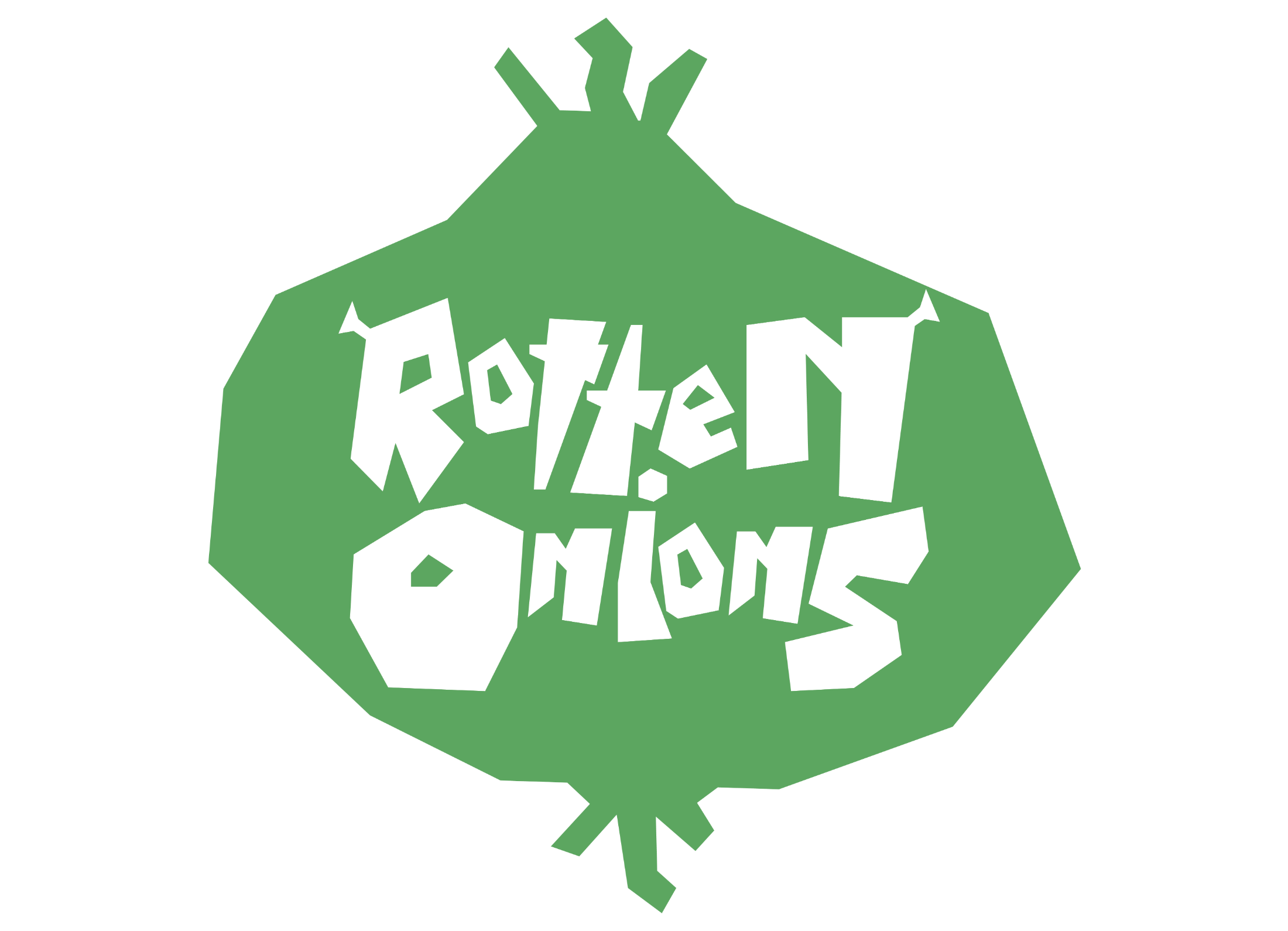
the onion badge
The process
The Brayway, in four steps.
same process, every brand
Step 01 · Discover
About the brand.
About the brand
Rotten Onion is a film podcast with one rule: every movie gets compared to Shrek. I pulled from Rotten Tomatoes, Shrek and the Oscars, and went for chunky, hand cut lettering.
Goals
→ Read as a parody without being a copy
→ Chunky, hand cut letters
→ A mark that works as a podcast cover
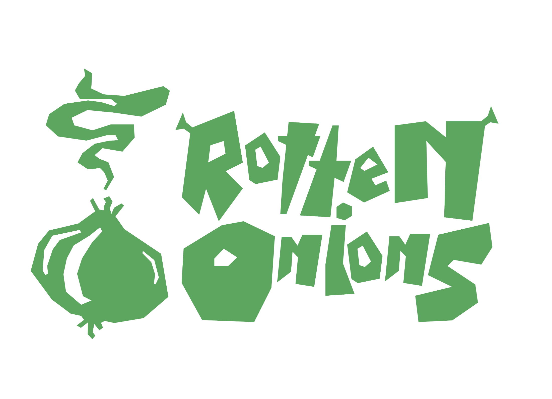
Show
Rotten Onion
Role
Logo designer
Year
2026
Type
Personal project
Logo
Lettering
Podcast Cover
Color Study
Step 02 · Sketch
Where it started.
Chunky letters first. I blocked out ROTTEN ONION in pencil, cutting every letter like it was carved out of a vegetable.
hand cut letters, first pass
every letter had to look like it was cut with a dull knife
Step 03 · Directions
How I landed on the logo.
The wordmark came first, then the onion. I tried it stacked and side by side, then pulled it all into a single badge.
01 · First draft
the wordmark
→
02 · Stacked
onion on top
→
03 · Side by side
the long lockup
→
04 · Final
onion and type together
Color passes
Step 04 · Build
The finished system.
Onion green, moldy olive and dirt brown on an onion skin cream. Gross on purpose.
Logo variations
Color palette
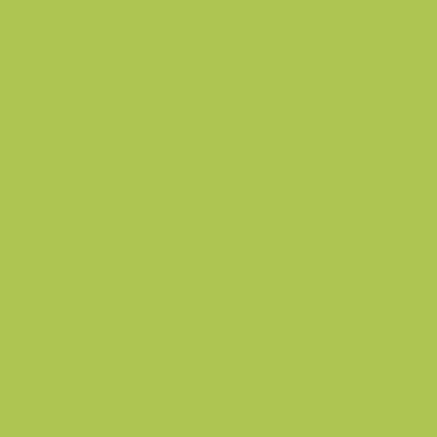
Onion Green
#AEC552
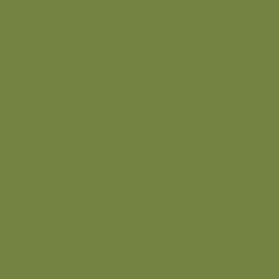
Moldy Olive
#758342
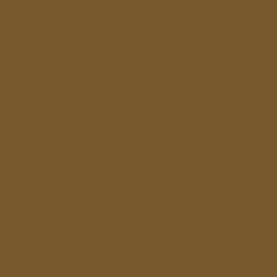
Dirt
#78582D
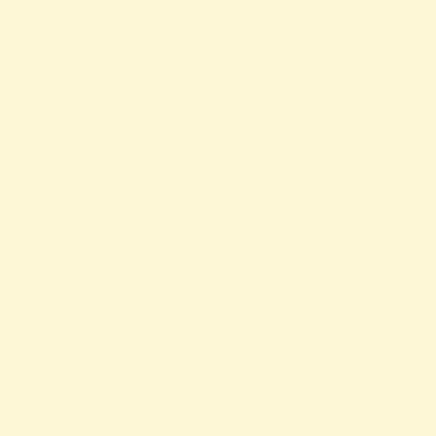
Skin
#FDF7D6
Rotten Onion ✶ Rotten Onion ✶ Rotten Onion ✶ Rotten Onion ✶ Rotten Onion ✶ Rotten Onion ✶ Rotten Onion ✶ Rotten Onion ✶
“Every film is better or worse than Shrek. There is no third option.”
Next brand